Brand identity
The symbol behind Rei Tatva
Every curve, leaf, and accent in our logo carries meaning — a visual reminder that healing is a continuous flow of balance, awareness, and vital life energy.
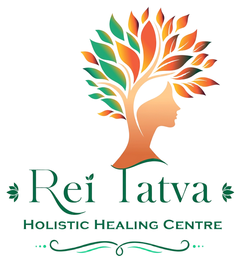
Rooted in wisdom, blooming in balance
The Rei Tatva logo unifies nature, self-awareness, and holistic wellbeing into a single continuous flow. It is an invitation to return to your true, unburdened nature — grounded like roots, open like branches, alive like leaves.
Tree of Life / Floral Silhouette
Symbolises deep-rooted wisdom, natural harmony, inner vitality, and personal growth. Like a tree, healing begins from the ground and rises through every branch of our being.
Human Profile
Embedded seamlessly within the trunk and branches, representing the individual's mind, soul, and personal wellness journey. You are not separate from nature — you are part of it.
Vibrant Leaves
The orange, red, green, and golden leaves represent the balancing of life energies (chakras), renewal, and holistic wellness. Each colour carries a frequency of restoration.
Ornate Accents
Framing elements around the typography anchor the traditional, grounded, and sacred nature of natural healing practices. They honour the lineage of wisdom we carry forward.
Unifying nature, self-awareness, and holistic wellbeing
At its heart, the Rei Tatva identity expresses one idea: when we align with the natural world and awaken to our inner self, healing becomes a continuous flow of balance and vital life energy. The logo is not just an emblem — it is a map of the journey we invite every guest to begin.
Learn more about our practice
Rei Tatva — Mind · Body · Soul